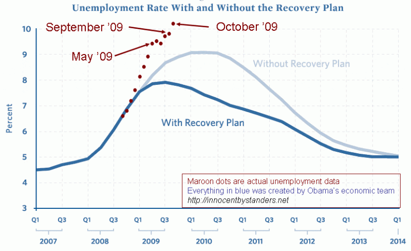
I DIDN’T LIKE THE EDITORIALIZING ON THIS CHART, and reader Paul Golba writes:
I wanted to comment about the House Republican Conference chart that you have on your blog. It is a piece of chartmanship, using a chart to mislead without actually making things up. You’ll notice that the bottom of the chart is roughly 7% with the top being the current 10.2%. While the numbers themselves are accurate, this setup uses a cherry picked range to make the differences look more dramatic. If the vertical range was 0% to 15%, which would be a fairly standard range for this sort of thing, the effect would be less impressive.
With that said, I would say this is just a minor violation of chartmanship. A chart with an unbiased setup still looks really bad. This just makes it look worse.
So how about this one?

