JAMES PETHOKOUKIS: A big (and updated) version of the biggest, most important chart in American politics.

And let’s just remind people of this chart, too.

For the record, and everything.
UPDATE: Reader Sam Harris recommends this chart, illustrating how the federal government has become “a giant wealth-transfer machine.”
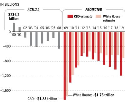
And reader Steve Nelson thinks I should repost this deficit chart: He writes: “It’s especially helpful to note that from 2001 to 2006 the deficit was actually going down in spite of wars and ‘Bush Tax Cuts.’ Then we let the Democrats take over the Congress in 2007, and everything started going south as they got the ability to spend money and impose new laws and regulations.”
Is there an updated version out there somewhere?