RAYMOND LOEWY AND SAUL BASS LEFT THE BUILDING A LONG TIME AGO: Corporate Flat Art Proves Big Business Is Infatuated With Ugliness.
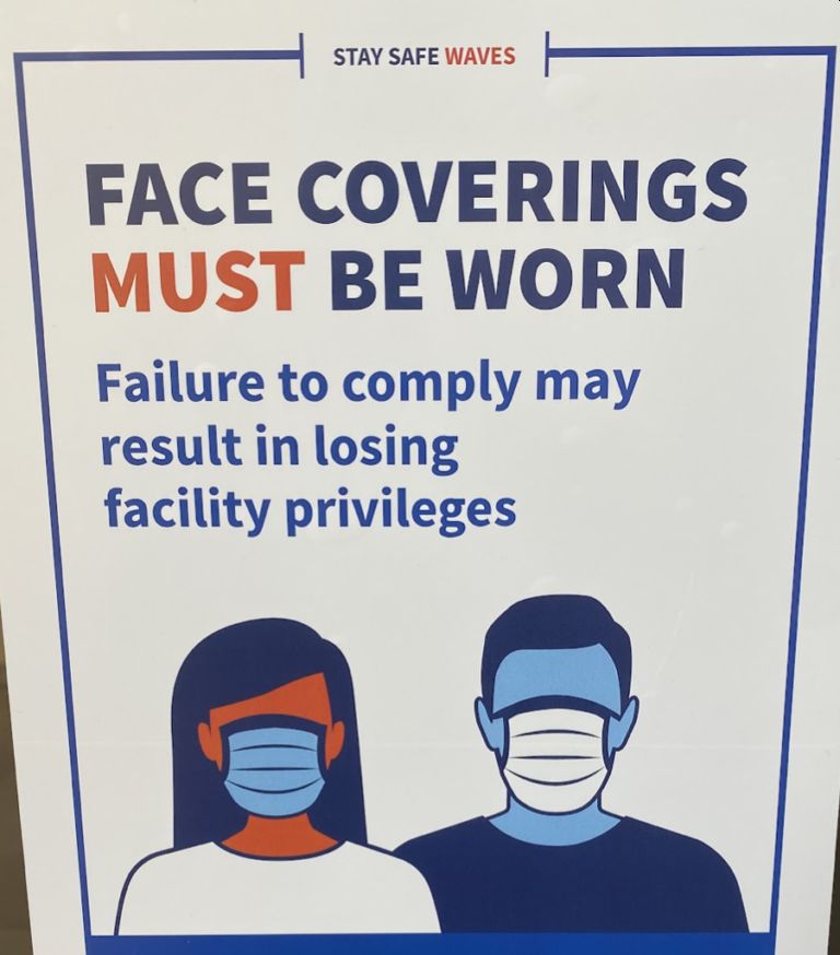
Consider one of big businesses’ oft ignored crimes against society; the soulless art frequently featured in their ads, often derisively referred to as corporate flat art, corporate Memphis, or even Big Tech Art. It’s everywhere, from The New York Times to Facebook to the popular dating app Hinge. It’s visible in The New Yorker, YouTube, the World Health Organization, the United Nations, and a litany of other organizations and companies.
When I queued up music and sat down to write this, I was bombarded with an ugly array of gangly armed flat people telling me that Google Fi is a “phone plan that can.” I’m even personally haunted by the specter of flat art whenever I enter my university’s gym.
https://www.youtube.com/watch?v=dc2RJwC1e7U
This unsettling ubiquity has given rise to a subreddit that’s dubbed it “globohomo art,” an abbreviation of “global homogenization.” Commenters condemn it as a style “mostly used by large companies and sociopolitical organizations that push for a globalized and homogenized society devoid of social and cultural identity.” While its widespread use and sheer ugliness has opened it to criticism and mockery, it’s struck a chord not simply for what it looks like, but for what it represents.
Last year, in one of his weekly “Wednesday Review of Modern Thought” segments at the Bleat, James Lileks was succinct in describing this form of corporate art: “It’s every big editorial page / feature page / magazine illustration. I noted this style a while ago, and was instantly annoyed by it. It’s Colorforms Totalitarianism.”

