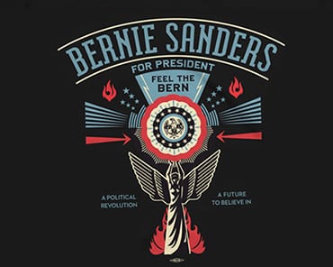
FINALLY: NEW LEFT-WING CULT GETS ITS OWN WEIRDLY SINISTER ICONOGRAPHY. Allahpundit has further thoughts on Shepard Fairey’s creepy Bernie Sanders logo. As Allah writes, “the design is actually a terrible representation of his candidacy, precisely because it’s so cold and graphically stark:”
True to populist form, Sanders’s campaign ads have been all about warmth and people. His first spot, the Simon and Garfunkel ad, mixed crowd shots with quaint images of Americans working on farms. The next major spot highlighted the supposed diversity of his coalition by combining shots of people’s faces from across the demographic spectrum — young and old, black and white, men and women. Again: People power. The third one that’s gotten buzz is the one featuring Eric Garner’s daughter talking about her father’s death. It’s intensely personal. The message in all of this, obviously, is that Sanders’s campaign isn’t about him but about all of the Americans who’ll be empowered by his movement. Socialism isn’t something to fear, it’s a brotherhood to be embraced. That’s a strong message and the ads are well done. Now here comes Fairey, the Obama idolater, to strip the humanity out of that message and reduce it to some chilly modern version of a WPA poster.
Read the whole thing.

